
As the world becomes increasingly digital, having a strong online presence is crucial for any business or individual. One of the key elements of a successful website is responsive design. In this blog post, we will explore the importance of responsive design and why it is essential for your website.
What is Responsive Design?
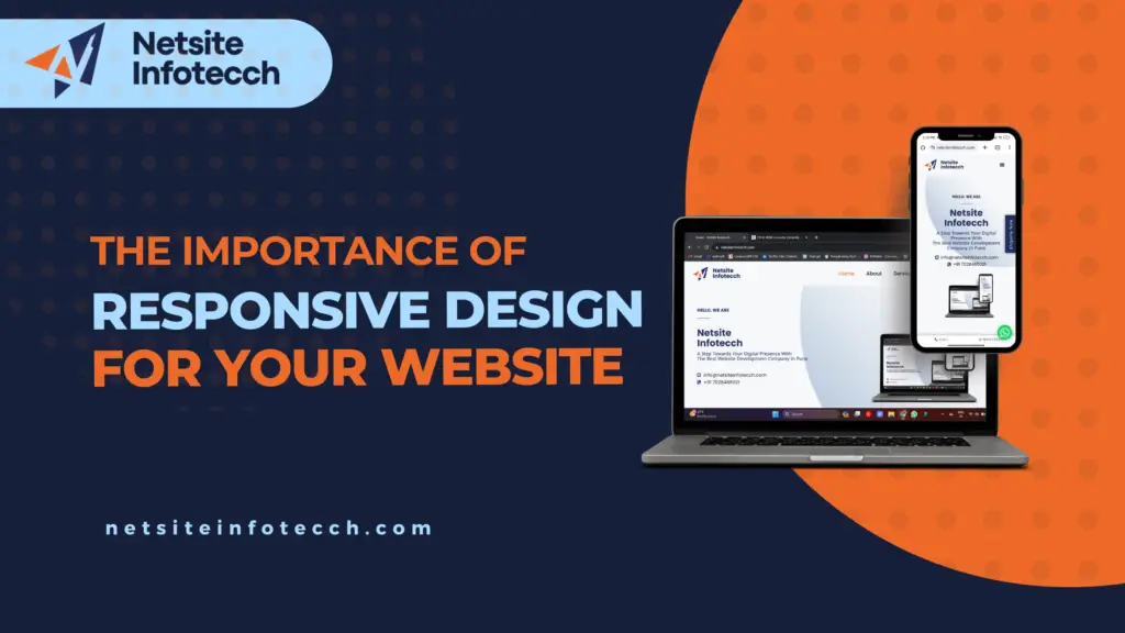
Responsive design is an approach to web design that ensures a website looks and functions well on any device or screen size. With the rise of smartphones and tablets, more and more people are accessing the internet on smaller screens. A responsive website adapts to these different screen sizes, providing an optimal viewing experience for users.
Enhanced User Experience
One of the main reasons why responsive design is important is because it enhances the user experience. When a website is not responsive, it can be difficult for users to navigate and interact with the content. Text may be too small to read, buttons may be too close together, and images may not load properly. This can lead to frustration and a high bounce rate.
On the other hand, a responsive website adjusts its layout and content to fit the screen size, making it easy for users to read, navigate, and interact with the website. Whether someone is accessing your website on a desktop, laptop, tablet, or smartphone, they will have a seamless and enjoyable experience.
Improved SEO
Another reason why responsive design is important is because it improves your website’s search engine optimization (SEO). Search engines like Google prioritize mobile-friendly websites in their search results. If your website is not responsive, it may be penalized and pushed down in the rankings.
By having a responsive design, your website will be more likely to rank higher in search engine results, leading to increased visibility and organic traffic. This can have a significant impact on your online presence and ultimately, your business’s success.
Cost and Time Efficiency
Investing in responsive design from the beginning can save you both time and money in the long run. Rather than creating separate websites for different devices, a responsive design allows you to have one website that adapts to all screen sizes. This means you only need to maintain and update one website, saving you time and resources.
Additionally, responsive design future-proofs your website. As new devices with different screen sizes are introduced, your website will automatically adjust to accommodate them. This eliminates the need for constant redesigns and updates, saving you money on future development costs.
Increased Conversion Rates
A responsive website can also lead to increased conversion rates. When users have a positive experience on your website, they are more likely to stay longer, explore your products or services, and ultimately make a purchase or take a desired action.
With a responsive design, users can easily complete forms, make purchases, and access important information, regardless of the device they are using. This seamless experience can significantly increase your conversion rates and help you achieve your business goals.
Conclusion
In today’s digital landscape, having a responsive website is not just a nice-to-have, it is a necessity. Responsive design enhances the user experience, improves SEO, saves time and money, and increases conversion rates. By investing in responsive design, you are investing in the success of your website and your business.
